Co-op – Online Groceries

Background

I work within Co-op's Digital Food Customer Experience Team, the aim of this team is help with the re-imagining of convenience retail. This project demonstrates understanding of complex systems and collaborating with engineers.

Team

Cross disciplinary team, design, product, front and back-end engineers, CRO, Membership team

Brief

A major pain point for our members shopping online is manually entering their 18 digit membership number to earn rewards. How might we automate this process and communicate this benefit?

Image showing a mobile phone

Discovery

Co-op Members earn rewards for every purchase they make. To do this they scan their card in store or manually enter their unique 16 digit membership number. The App team were working on putting a web view to the Ecom store into the app – meaning we would have a lot more customers who were members coming to the store.

The outcome we were trying to reach with this work was automate this process so that members coming to the site wouldn’t have to find their card and enter their membership number. This would be even more frustrating for those App users since they would have to close the web view to find their number then open the web view again – causing confusion and possible frustration around whether their shopping would still be there.

Below are screenshots showing the experience. Important to note is the guest checkout flow and how we allow guests to enter their membership number, this isn’t ideal as we want more customers to be logged in.

Image showing screenshots of Tesco, Asda, Sainsburys, Deliveroo and Gopuff.

Process mapping

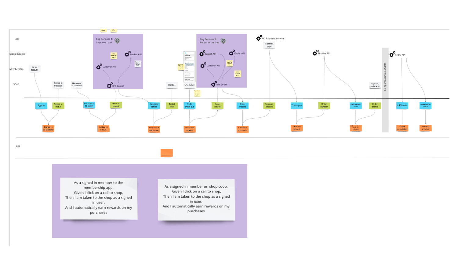
A process map helps teams understand how services work by breaking down the journey flow. This is usually done through a diagram to visualise how parts of the service communicate to each other.

To understand the technical complexities I mobbed with the engineers on a process map. I really enjoy working with different disciplines and this activity to learn more about how to the service works helped me create a more effective and realistic solution.

Image showing screenshots of Tesco, Asda, Sainsburys, Deliveroo and Gopuff.

Design

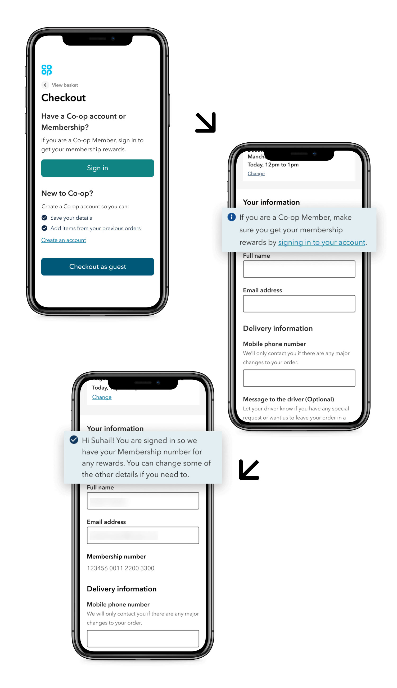
The main thing I focused on in the design phase was making sure signed in Members knew that the reward process was now automated. This was communicated through an updated message at the top of the page and plain text displaying their number, reducing any worry they would have about missing rewards.

One of our other outcomes was increasing the amount of signed in customers and I did this through two ways. When a guest checks out they are no longer able to enter a membership number. They now see a message at the top of the page reminding them that if they are Co-op Member they can earn rewards by signing in with a prompt to do so. I worked with our content designer to make sure the language we used was clear and consistent in how the Co-op talks about Membership.

Another change I made was optimising the hierarchy of the sign in prompt at the start of the checkout. Previously we prioritised the quickest route to payment which was as a guest but now we were more established and wanted to increase signed in transactions so I made the sign in prompt the primary action on the page. Coupled with messaging around the benefits of doing so.

Below that a section that again promotes the benefits of making an account with a “create an account” link and finally the guest checkout button at the bottom. With these design decisions I was looking at the long term strategic direction of the service and how we can over time change the balance of signed in and non-signed in customers.
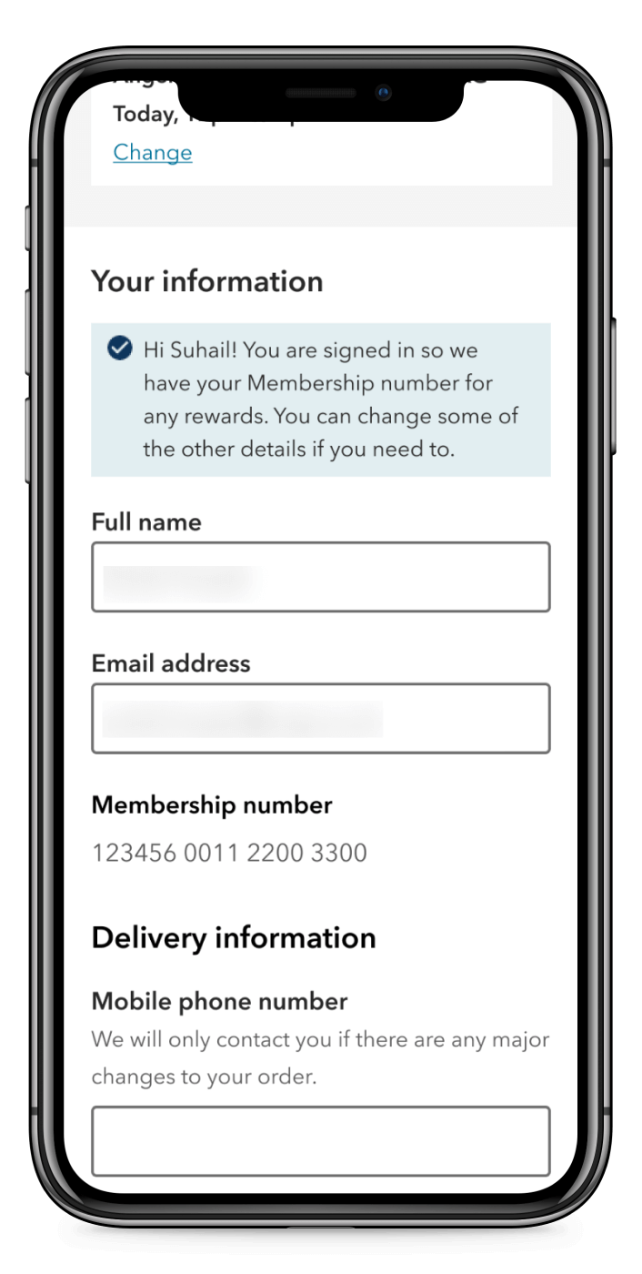
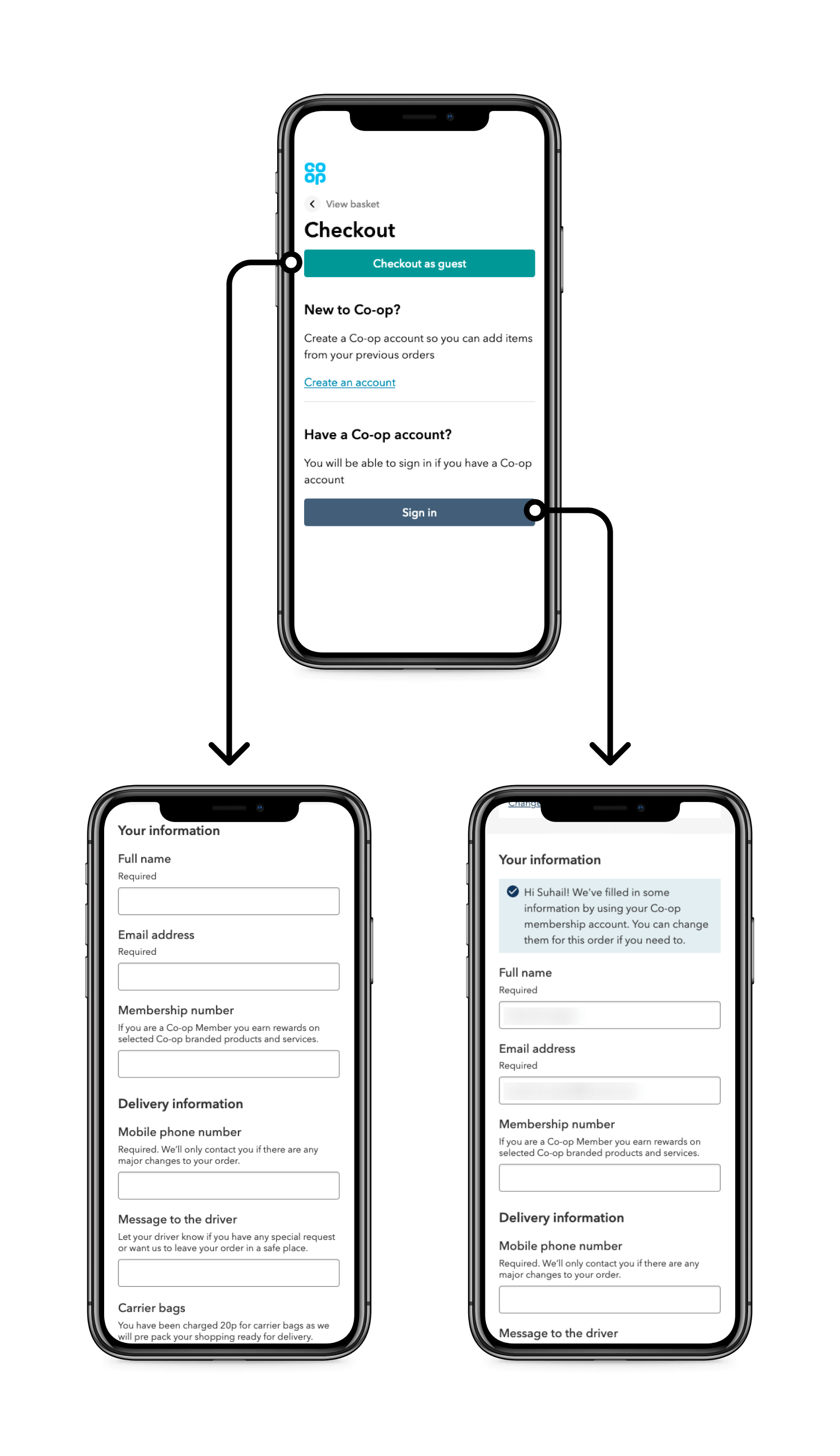
Image showing screenshots of Tesco, Asda, Sainsburys, Deliveroo and Gopuff.

Results

Previously we had issues around seeing customers who we knew had accounts complete a transaction using a guest checkout. Since launching we have seen a huge increase in the amount of signed-in members checking out so we have definitely seen a behavioural change with this project.