Co-op – Online Groceries

Background

I work within Co-op's Digital Food Customer Experience Team, the aim of this team is help with the re-imagining of convenience retail. This project is all around continuous improvement.

Team

Cross disciplinary team, design, product, front and back-end engineers, CRM team, CRO, merchandising

Brief

Due to shortages of lorry drivers and supply chain problems, retailers across the UK were seeing issues affecting their stock availability. Orders are fulfilled by local stores and customers didn’t need to enter any information about themselves to browse products on our grocery site.

This could lead to disappointment when browsing the site as they could see numerous out of stock products. But that’s not all, when their grocery delivery arrives they could be missing important items from their order which leads to further disappointment. How might we learn a customer’s location before browsing to show relevant products?
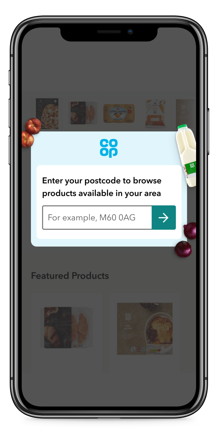
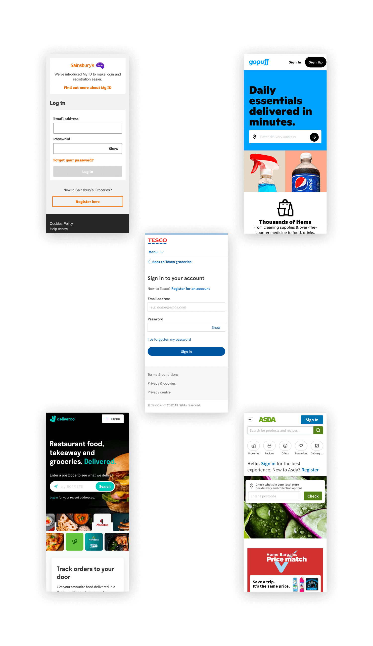
Image showing a mobile phone with a modal with an postcode input

Discovery

The outcome of this work was to support work on providing a more accurate stock availability and also a campaign around free delivery. As said above we needed to understand where the customer is to show them relevant products. The current method of doing this was once a customer adds a product to their basket but this is far too late as customers will be free to browse the site and have a false sense of products available to them. The first iteration of this project was a prompt to ask a customers location before being able to browse the site and see products from their local store.

As well as customers seeing a more accurate product range, another outcome we were looking to achieve was a better understanding of how customers onboard onto our service and less contacts to our customer service centre (due to unavailable products being sold).

After doing some competitor research I saw that the most common approach was prompting customers with a hard stop. Asking them to enter their postcode or sign in before looking at products. While the latter might be fine for returning customers it could be too high of a barrier for new customers. They came with the mission of wanting groceries and are now being asked to make an account. From previous research I knew this approach could add to the problems we were having – customers wanted to see products as soon as possible.

Image showing screenshots of Tesco, Asda, Sainsburys, Deliveroo and Gopuff.

Design

Leading on this project, I believed that by prompting potential customers to enter their postcode before browsing the site we can show them a more accurate product range and still provide a low barrier to entry. Therefore leading to a better customer experience. I worked closely with the CRO team (conversion rate optimisation) to quickly test this hypothesis – we focused on metrics around checkout progression and drop out to understand the change in behaviour.

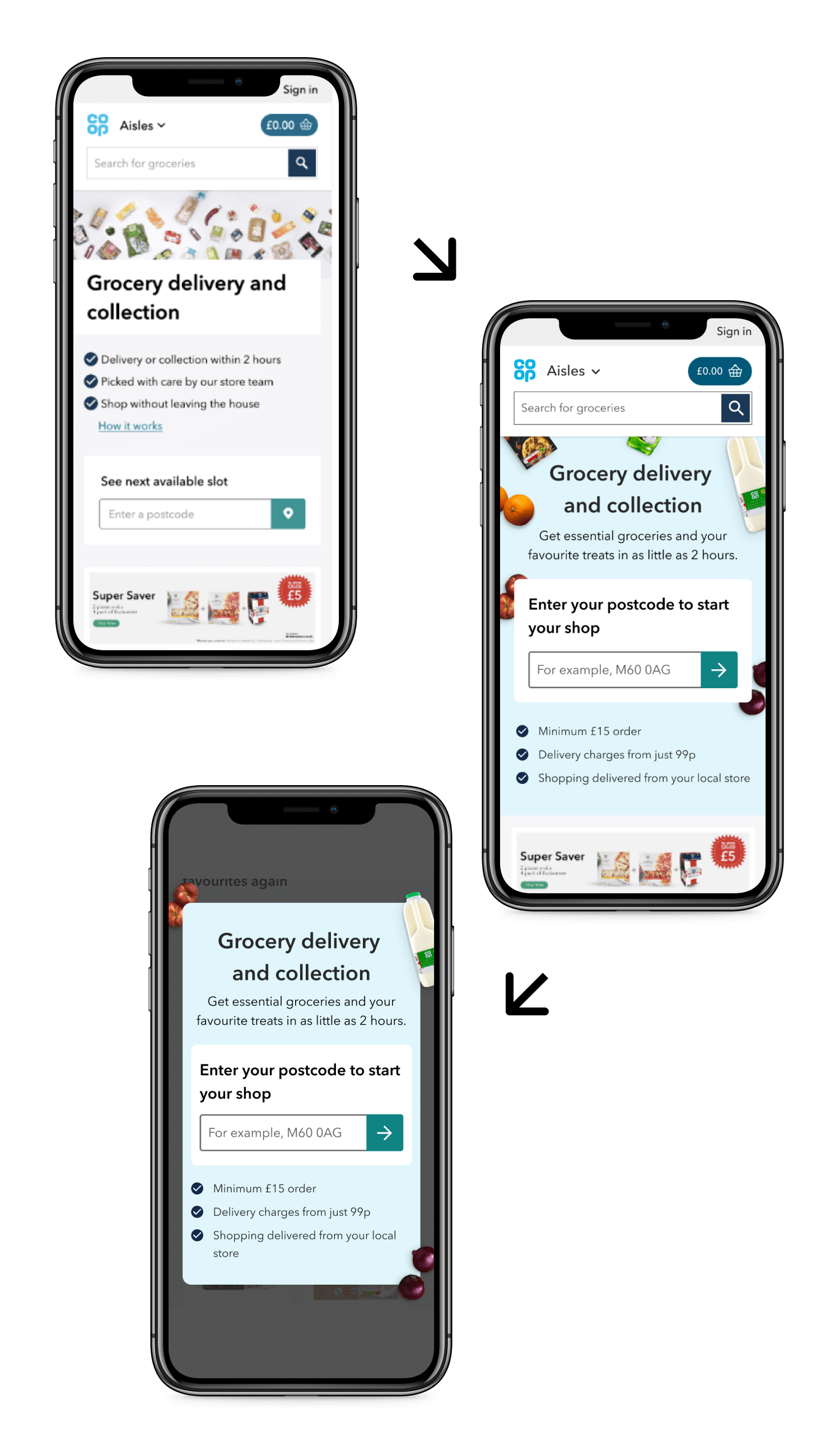
We had previously tested the content on the homepage to help onboard customers. I redesigned the postcode component to have more prominence and worked with our content designer and the marketing team to update the USPs (unique selling points) explaining the service. This was a successful test and led to more customers converting but didn’t help the outcome we were trying to reach in this project.

So using the learnings of that test I designed a modal that work appear when a customer lands on our site, regardless of what page. I believed the customer would see the content behind the modal to be reassured that this is a temporary stop in their journey and would be encouraged to enter their postcode knowing they’ll be able to shop quickly. I also added the USPs of the first test – since that content helped convince customers.

Image showing 3 mobile screens, first shows the homepage, second showing a revamped homepage, third showing a modal

Design

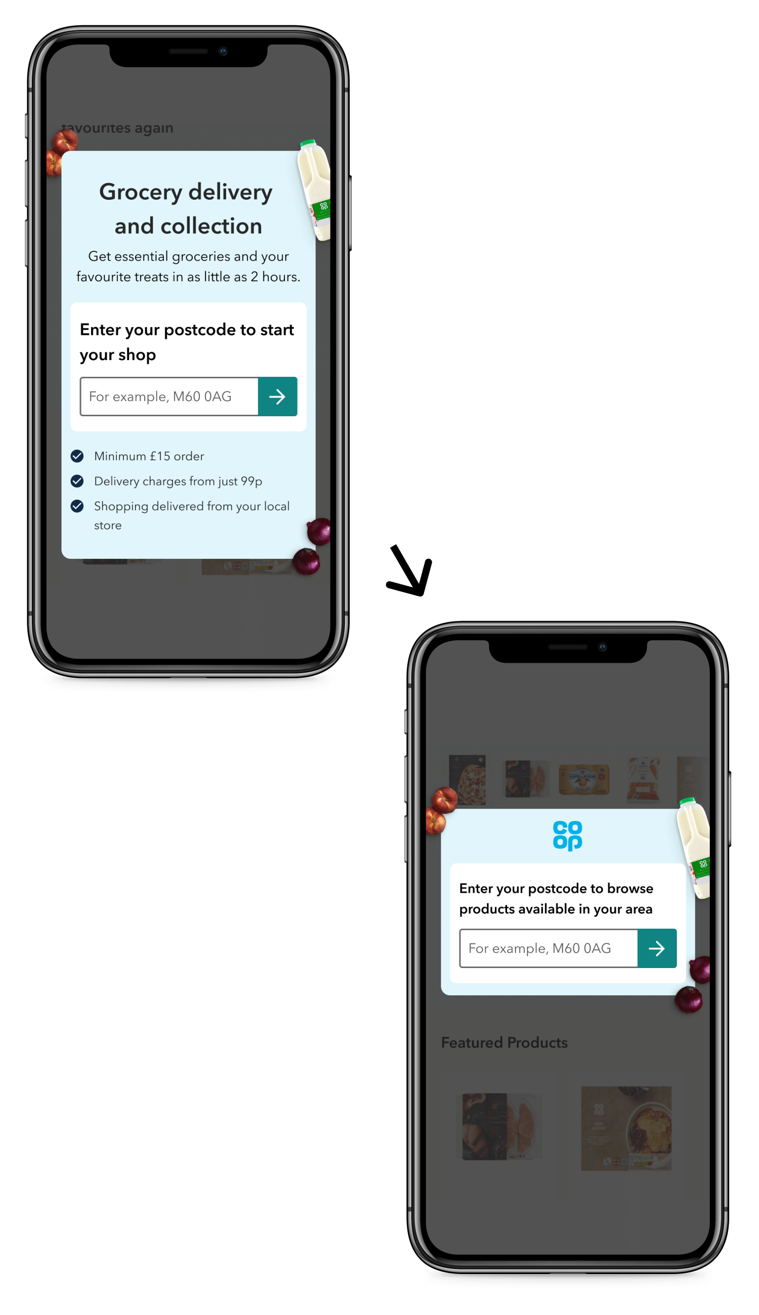
This first test was unsuccessful, leading to more customers bouncing and less converting on the site. But because we were doing this through A/B testing we were able to learn and adapt quickly. For the next iteration we removed the USPs and changed the language to focus on browsing rather than shopping. This reassured the customer even more that there was no commitment, and they were free to just browse the site.

This version was successful as we saw a 4% increase in conversion rate and an increase in basket value. The increase was even higher for new customers which gave us the indication that they didn’t need information about the service or how it works. This gave me and the team enough confidence that it would ease the issues we were seeing because of the stock availability issues.

Image showing 2 mobile screens, first showing the before with the homepage and the after showing a new modal

Next steps

This was just the first step in improving the onboarding experience and learning more about how our customers come onto the site and use the service. One of the next steps in the strategic direction of the product is improving the journey for returning customers by prompting them to sign in when adding a product. This is because signed-in customers generally have a higher basket spend but would also benefit from features like previous orders.