N Brown is the parent company of brands Simply Be, Jacamo, JD Williams, as well as many more. Each brand has a different demographic so each design solution has to cater for those audiences. But also has to be efficient in terms of development time.
4 designers, 2 design managers, 1 researcher, CRO, FE/BE developers, product managers, SEO
During my time at N Brown the company was going through a digital transformation. The first few projects I led on were very much BAU (business as usual) – general optimisations to the site that could increase site conversion and revenue. The technology the ecommerce sites were built on is very outdated and over time that meant there was so much debt debt and inefficiencies in our process. So the technology started redesigning and rebuilding the Simply Be site in React. Two of the outcomes we wanted to achieve with this project was a faster shopping experience for customers and a more efficient environment for developers (leading to a more regular release cycle). Both would result in an increase of revenue for the business.
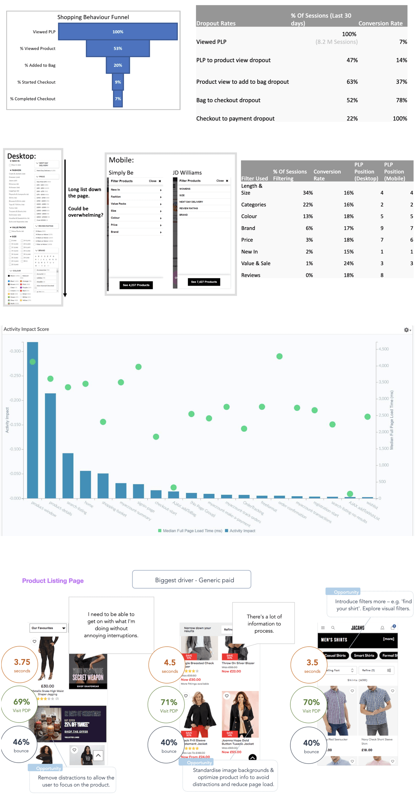
I led on the redesign of the “browse” part of the journey – specifically the product listing pages (PLP). The start of my design process involves understanding the problems with the current service. This includes desk research like competitor analysis and looking into previous research. I briefed the analytics team to understand user behaviour during sessions – This, in combination with user recordings helped indicate pain points and opportunities.
I then worked with our researcher to conduct further user interviews, giving us context to the pain points we found in the initial data. One of the features that often had it’s value questioned was reviews, through data we saw a low interaction rate but in the interviews the customers said they value them highly and they help them make a decision.
In the initial discovery phase we found that the page weight and load times were high across the site and as I said above, one of the outcomes was a faster shopping experience so it was important to focus on reducing that. Especially since the data indicated that users were prone to bounce really quickly. In the image below you can see that the PLP has the highest impact for users but also has the highest load time, by reducing this it would help us achieve that outcome.
I now had a better understanding of how customers used our site so I spoke with key business stakeholders to understand their long term team goals and problems. This was done through workshops, design reviews and crits of the current service. This allowed me to properly shape the project, decide on more specific outcomes and what success means for us.
Once we had a clearer idea of the problems I started to look at solutions. One of the ways I did this was working closely with the CRO team and leading on MVT and A/B tests. This was to generate incremental gains in a shorter period of time and to help achieve longer term strategic goals.
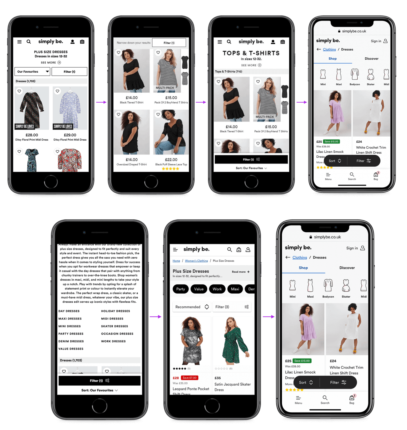
One of those tests was on the sort/filter functionality and had multiple iterations. From our research, I knew customers who filter had a 10% point higher chance of converting so using my designs, we tested making the filter button more prominent to prompt more users to filter.
The latest iteration tested both position and prominence. One of the challengers met the hypothesis with a 10% increase in CVR (conversion rate) and led to a +£2.6m increase in revenue based on CVR.
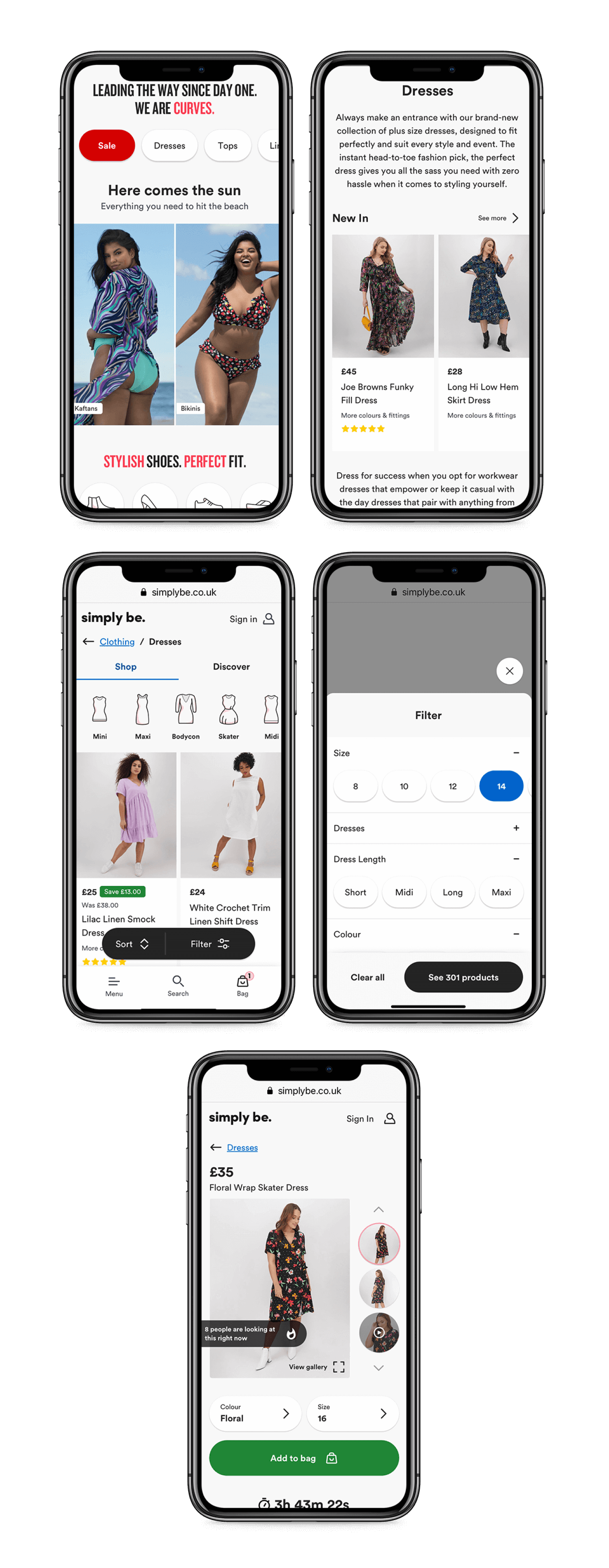
Another change we made was the introduction of quick filters at the top of the PLP. These linked to sub-categories and was to push customers further down the funnel, which again, would increase the chance of converting.
After implementing, there was a 33% uplift in filter usage and bounce rate was dropped by 15.1%.
As I said above, testing was done to help us achieve those longer term goals so I worked with our developers and further iterated on these tests to make them possible in the new framework they were building.
Alongside that testing I made several design changes based on the research we had. To help customers scan products I looked at the product information and changed the hierarchy – making the price the largest and first thing people see after the product image.
For user research and to help stakeholder engagement we produced a prototype. In a company so large there are a lot of teams responsible for different parts of the sites so I made sure we were aligned on the decisions being made.
To increase our efficiency and ensure the whole company had a consistent way of creating content we created NBUX (ux.nbrown.co.uk). A guide of rules and principles for designing for N Brown. It helps designer and developers, as well as brand teams and third party groups.
With this project, I helped write guidelines (accessibility and colour). Also working with the other designers to create a Sketch library of icons and components that can be used across the family of brands. It also made redesigning the site easier since we had ready-made and tested components.
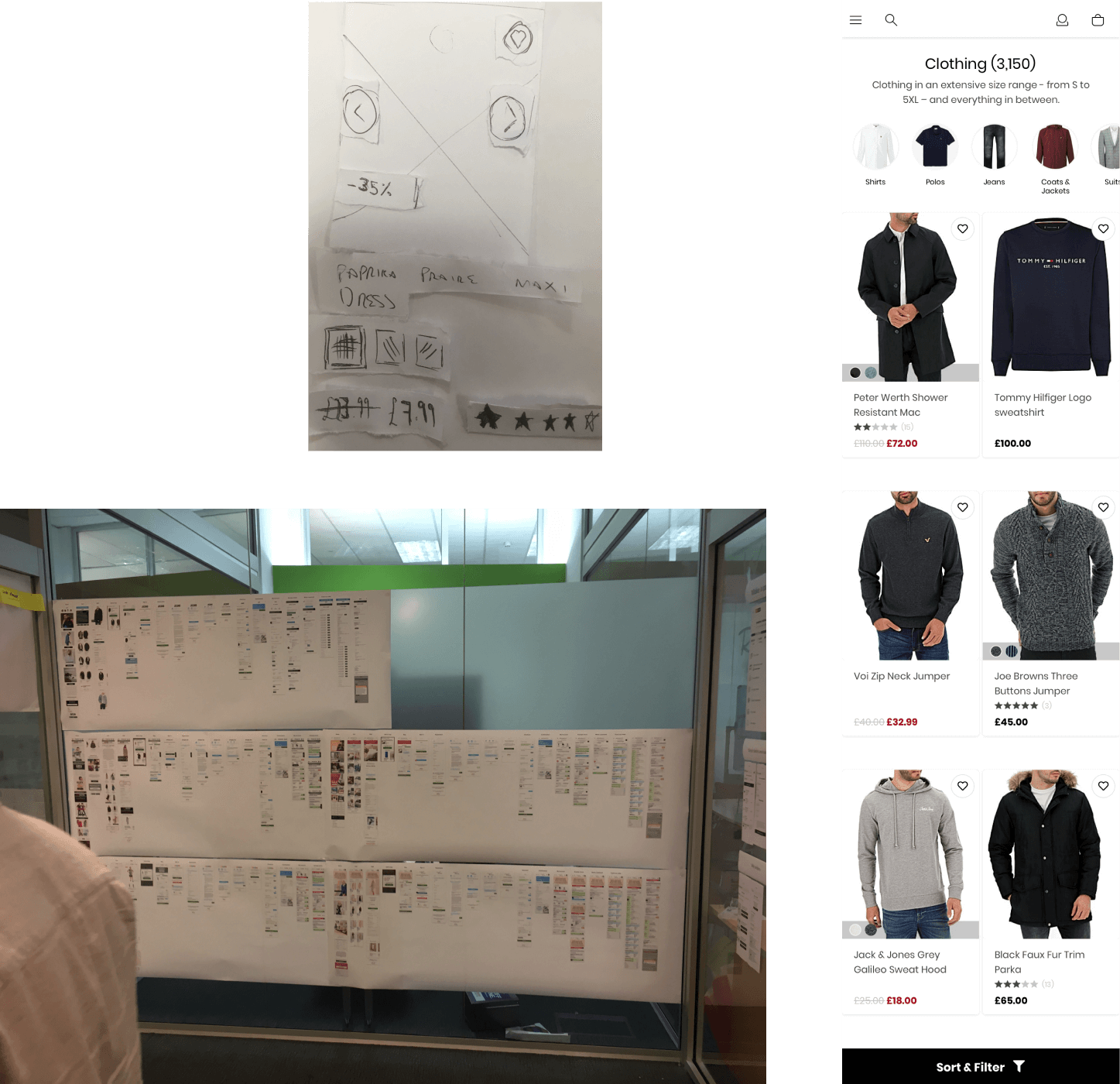
Here are some images showing how I work. Sketches and a paper prototype to quickly test ideas and features.
On the right are early lo-fi designs that I used for user testing. These used assets from an early version of our design system so it was both quick to design and usable for testing.
Below is a sitemap of the 5 main brands. This was part of a project to identify shared components and third parties. It also helped in workshops when discussing particular customer journeys. I then used this sitemap to help create a service map to identify problems and opportunities along they journey.