Swinton - Email Marketing

Brief

Marketing emails were seeing a decline in engagement over time, I was tasked to increase that and conversion across 4 marketing emails.

Team

2 designers, 2 developers, 1 project manager, external brand team.

Outcome

The purpose of the newsletter is content engagement and website traffic. This tied in with a secondary target of increasing sales. Implementing email design principles enabled the design to focus on the content rather than overloading the user with too much information.

Image showing a mobile phone

Discovery

After meeting with the stakeholders to gather requirements and understand scope, I analysed the data we had on the email (heatmaps, usage statistics) and found the following:

Image showing customer data and research

Synthesis

Articles and competitions are distinguishable enough, but the competition should have more prominence. This will ultimatley be the hook to get customers to read through the content

Terms and conditions inside the Insurance Offer cards increases the amount of time needed to process the information. Collaboration with the compliance team is needed to understand whether we can reduce this.

Based on the click rates, I rearranged from low-to-high and high-to-low. This gave me a better idea of how the newsletter should read and what the reader's priorities are.

Image showing a mobile phone

Design

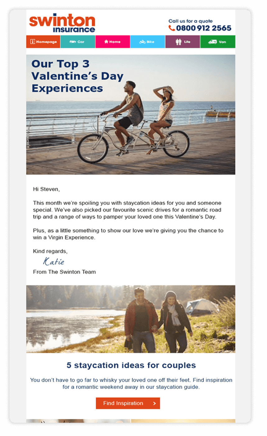
By removing the huge amount of CTAs the hero image is a lot clearer and has more impact.

After moving the banner to the bottom of the email, the text was made larger and full width. The email is signed off by "Katie from the Swinton team". This was done as a result of a test – where a female name received more opens than a male name or a generic “From the team” sign off.

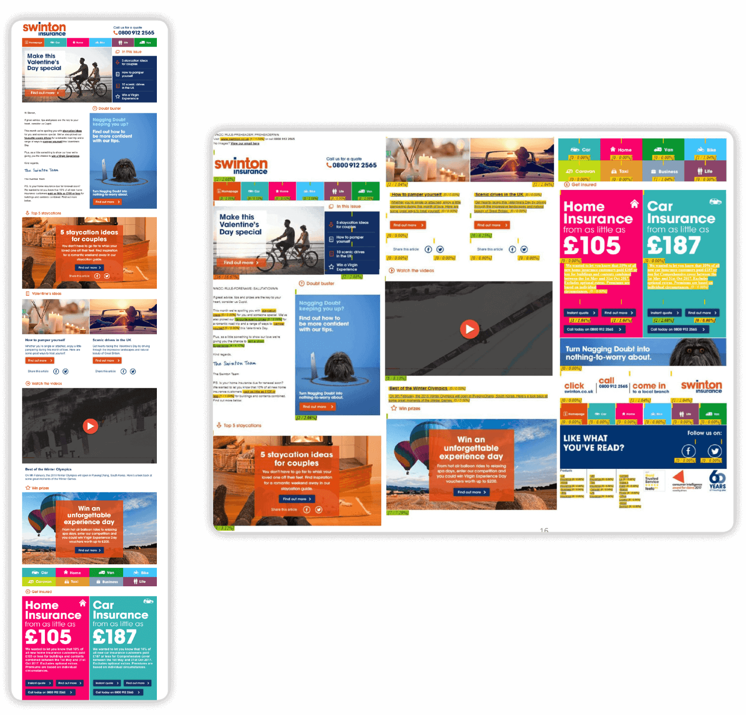
Articles have a better hierarchy and distinct styles that allows readers to separate content when scanning the newsletter.

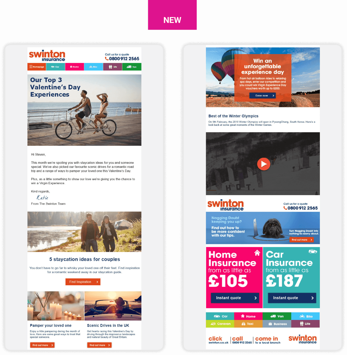
The competition was placed higher than the Olympics video as it was related contextually to the theme of the articles. Also, competition entries were of more importance than video views.

The price in the Insurance Offer cards were made larger to draw the readers eye. This, combined with the reduced copy and CTAs made the process of engaging with the offer a lot quicker and easier on the reader.

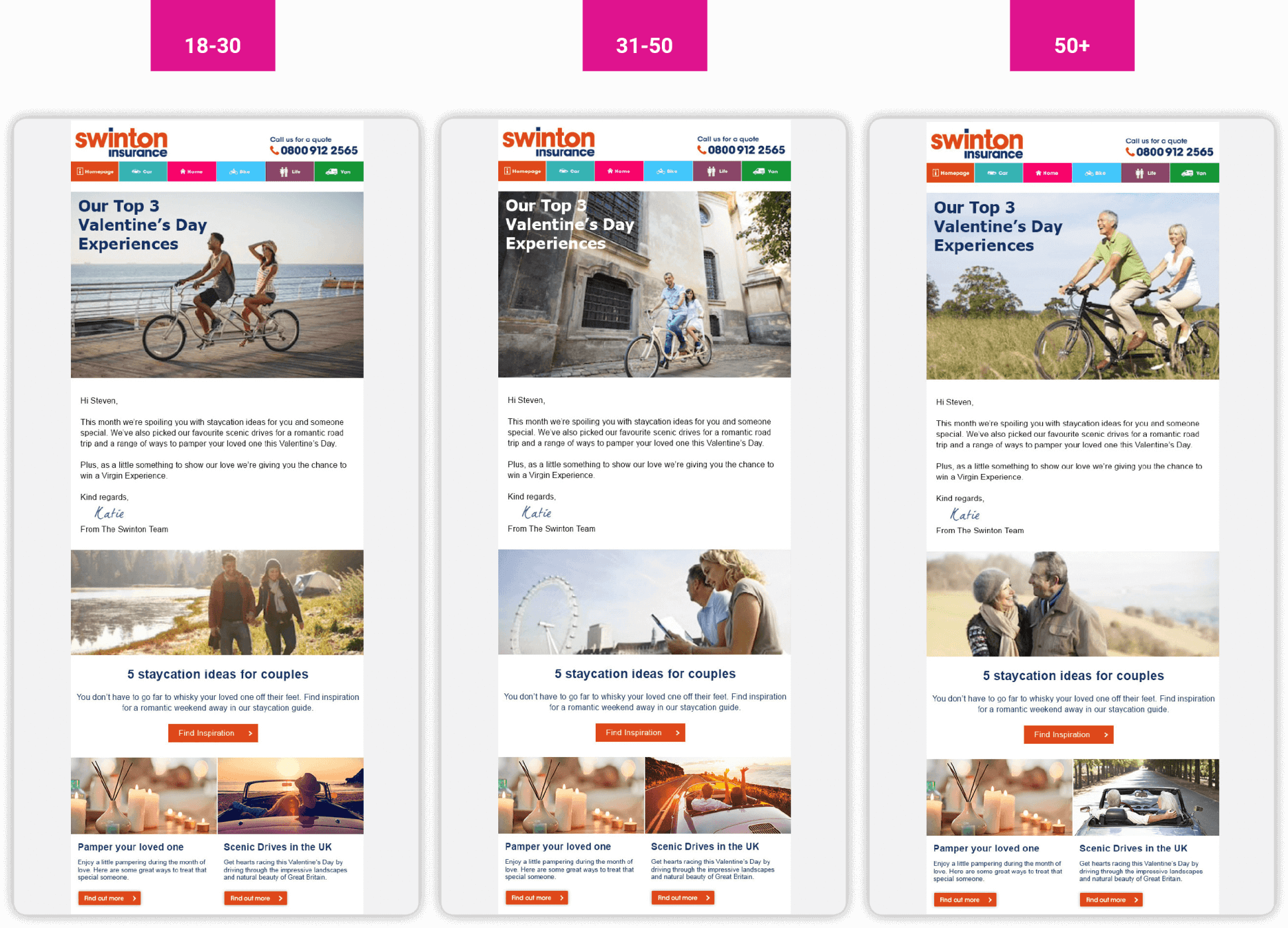
Using the database of readers, the imagery will be tailored to the reader’s age group and marital status. This will make open to the door for future personalisation and add context to the reader's journey.

Image showing a mobile phone